
The Pantone Color of the Year “award” is a big moment in the world of fashion.
So, when Pantone decides to break all the rules this year by choosing two colors instead of typical one for the first time ever, fashion influencers everywhere nearly broke Twitter (not really, but there was a whole lot of tweeting going on!).
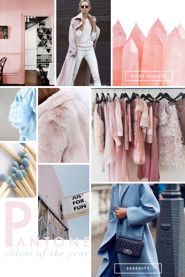
The colors they picked for twenty sixteen are Rose Quartz & Serenity. Rose Quartz is a pale pink shade & Serenity is a pale blue. Naturally, your first thought would be, baby shower vibes for boy/girl twins. But that is not the feel they are going for with their picks at all.
Leatrice Eiseman, executive director of Pantone’s color institute says “Rose quartz is not baby pink” & “It doesn’t have that wimpy feel.”.
There is a real science into why Pantone chooses the colors they do. They aren’t just picking them out of a hat & setting a color trend from thin air. They start early in the year, do a lot of travelling in search of trends in all arenas (home, clothing, accessories, tech, etc.), lots of photos are taken of the trends they spot for proof of a developing color trend, they also do a lot of consulting with interior designers, fashion designers, manufacturers, & retailers on what colors they plan to use for their designs in come twenty sixteen. The whole team is involve in this decision, & IMO, sounds like a pretty legit gig. I wonder who gets to choose the names, I think that’d be the best part.
As for my thoughts on the color picks, you guys probably think I’m anti these pastel shades, but for some odd reason (shocked myself) I am kind of feeling it. I have sworn off pink for life, but this def. has be reconsidering. It is actually uber chic & very minimalistic.
Also, I love the fact that these color choice also represent gender equality & fluidity. These choices are meant to show the consumer they can be completely comfortable using color to express who they are. From a psychological perspective, these two colors also represent tranquility, security, & wellness.
See below for my top Rose Quartz & Serenity picks, & LMK— do you guys like this years color picks or nah?
x, E
The Edit | Rose Quartz
especially loving: crossbody clutch by Spell & The Gypsy Collective (so rad!!!), dusty rose oversized trench coat (very minimalistic), & this fluffy fur pink clutch.

The Edit | Serenity
especially loving: Kimchi off the shoulder ribbed knit crop top, Rebecca Minkoff mini tote (the structure of the bag makes the color super edgy!), pale blue double breasted coat, & this super cool leather jacket by Veda.
I love pink & blue. My living rooms had these two colors for years. Yellow & blue also. Cheery colors. And live nature colors. Green ?
I like the light blue serenity coat. I think it really looks trendy. Ofcourse loving the pink as well.